Logo
“a logo is a flag, a signature, an escutcheon, a street sign. A logo identifies. A logo is rarely a description of a business. A logo derives meaning from the quality of the thing it symbolizes, not the other way around. A logo is less important than the product it signifies; what it represents is more important than what it looks like. The subject matter of a logo can be almost anything.”
Paul Rand
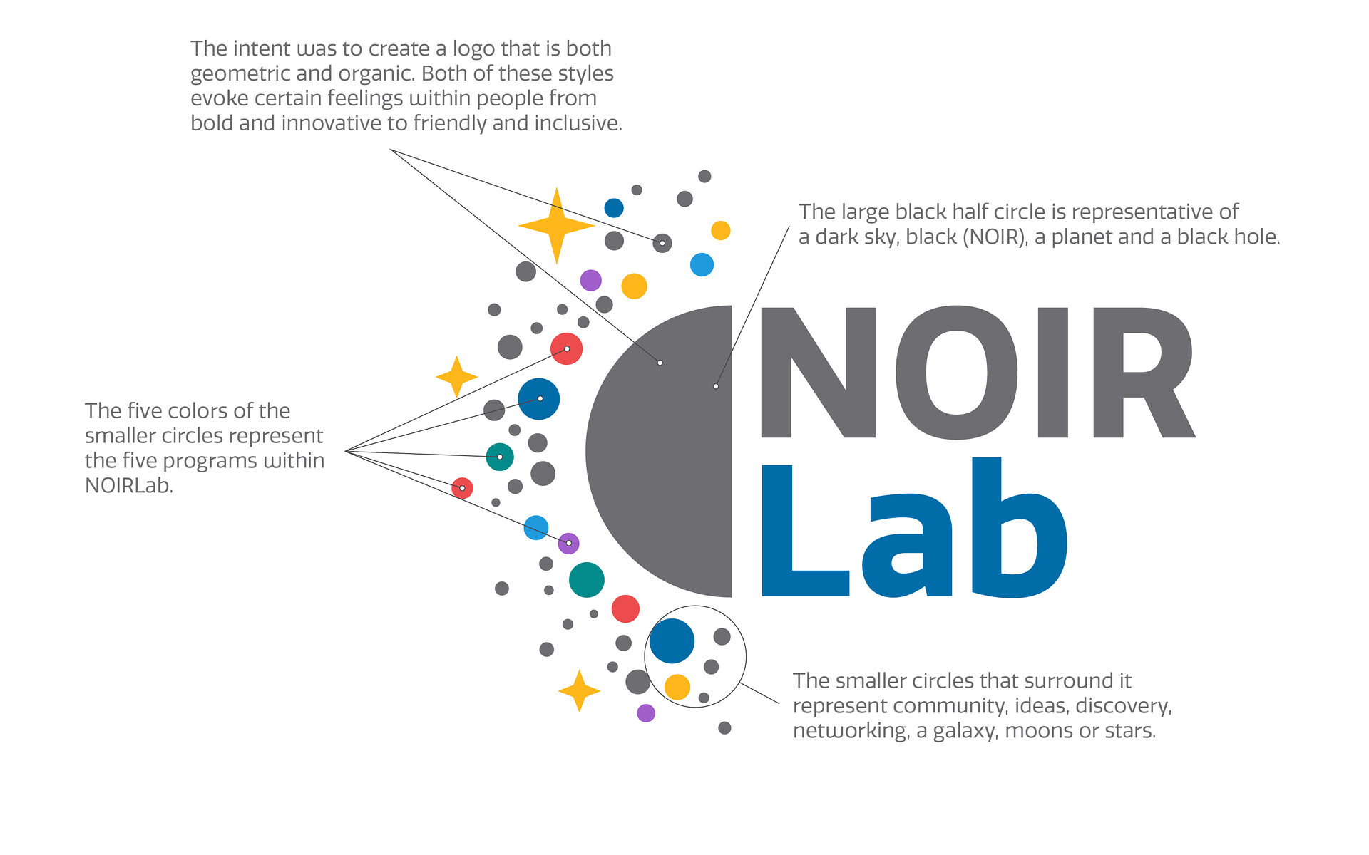
The NOIRLab logo is based on a design brief and on keywords from the nationalastro.org: community, innovation, ideas, diversity, exchange, creative, development, science and discovery.
- The designers considered how these words relate to NOIRLab and its programs, and how to make these words into imagery.
- The developed logo has numerous meanings:
- The large black half-circle can represent a dark sky, black (NOIR), a planet or a black hole.
- The smaller circles that surround it represent community, diversity, ideas, discovery, networking, a galaxy, moons or stars.
- The five colors of the smaller circles represent the five programs within NOIRLab.
- The intention was to create a logo that is both geometric and organic. Both of these styles evoke certain feelings within people, from bold and innovative to friendly and inclusive.
NOIRLab text
Short name for the NSF’s National Optical Infrared Astronomy Research Laboratory.
Text choice:
- sans serif fonts: innovation
- bold fonts: power
- straight fonts: stability
Version
The full color "stacked" version is the preferred version of the NOIRLab logo. When using the logo at a small size (difficult to discern individual dots) or against a background that is low in contrast, a single color version would be appropriate. You may find both a solid black (for light backgrounds) and solid white (for dark backgrounds) version of the logo in the archive.
NOIRLab
|
 |
|
NOIRLab Horizontal |
||
NSF + NOIRLab |
||
AURA |
|
Visual Identity
 The NOIRLab Visual Identity, or Branding Manual, provides an overview of the use of the logo, fonts, colors, and any other visuals that we use to communicate NOIRLab brand.
The NOIRLab Visual Identity (VI) is the official “manual” that sets out the visual aspects of branding that we create in order to evoke certain feelings and experiences connected with our identity.
